The best LinkedIn banner makes one clear promise, backs it with visible proof, and puts that message in the mobile-safe center-right zone where LinkedIn’s crop and profile photo won’t swallow it. That’s the whole formula. Everything else is styling.
Before you scroll through ideas, lock in these four things:
- Canvas size: 1,584 x 396 pixels, exported as sRGB JPEG.
- Safe zone: keep text and logos in the center-right band, not tucked behind the profile photo.
- Clear left side: your headshot overlaps the bottom-left corner on desktop and mobile, so nothing critical goes there.
- Contrast first: if you can’t read your own tagline at a glance on your phone, neither can a recruiter.
Pick one idea below that matches your goal, swap in a template, and update your banner before you close this tab.
Table of Contents
- 1. LinkedIn Banner Ideas That Actually Get Noticed
- 2. How to Pick the Right Banner for Your Goal
- 3. Where to Find Templates, Images, and Editable Files
- 4. LinkedIn Banner Size, Safe Zone, and Export Settings
- 5. Fast Dos and Don’ts for a Professional Banner
- 6. What Hiring Teams Actually Notice: A TalentFB Insider Checklist
- 7. What to Write on the Banner: Tagline, CTA, and Placement
- 8. Customizing Templates Without Losing Your Personal Brand
- 9. Banner Ideas by Industry and Role
- Pick Clarity Over Cleverness
- Get Your LinkedIn Banner and Profile Built Right
- Frequently Asked Questions
- Sources
1. LinkedIn Banner Ideas That Actually Get Noticed
Recruiters and hiring managers skim profiles in seconds, so your banner needs to work as a billboard, not a scrapbook. Here are 17 concepts worth stealing, organized so you can find one that fits your role fast.
- City skyline — signals location and market focus at a glance; swap in your actual metro for local credibility. Zapier’s banner gallery uses this as a go-to for consultants and relocators.
- Product or service shot — shows what you build instead of describing it; product managers and founders benefit most.
- Job-search positioning line — a short line like “Open to VP Engineering roles, APAC” works better than a generic “Open to Work” banner.
- Results graph or chart — a simple upward line with one metric (revenue, users, retention) does more than a paragraph of bullet points on your resume.
- Testimonial strip — one short quote from a manager or client, sized so it’s legible on mobile.
- Minimalist icon row — three or four icons representing your core skills, useful for consultants juggling multiple specialties.
- Hobby or passion image — a subtle marathon photo or instrument shot humanizes an otherwise buttoned-up profile.
- Workstation or workshop shot — shows your actual environment; strong for tradespeople, developers, and creatives.
- Service pillars — three short labeled columns (“Strategy,” “Execution,” “Coaching”) for consultants and coaches.
- Logo wall — past employers or client logos, best for freelancers and agency founders building trust fast.
- Portfolio preview — thumbnail grid of work samples, ideal for designers and marketers.
- Solid brand color with wordmark — clean and fast to build in Canva when you want zero visual noise.
- Social proof badge — “Forbes 30 Under 30” or a certification mark, used sparingly so it reads as credibility, not clutter.
- Direct CTA banner — “Book a call” or “See my portfolio” with an arrow pointing toward your headline.
- Quote or personal motto — a short line that reflects how you work, not a generic inspirational quote.
- Headshot with offset framing — your photo repeated small and off center, reinforcing brand recognition beyond the round profile icon.
- Abstract pattern in brand colors — a safe, professional fallback when you want polish without a photo shoot.
For each of these, Adobe Express templates give you a fast starting point, especially if you’re not comfortable designing from scratch. Keep your center-right zone reserved for the one sentence you want remembered, and keep the bottom-left clear of logos, faces, or text that the profile photo will cover.
2. How to Pick the Right Banner for Your Goal
Your banner should match what you’re actually trying to accomplish this quarter, not just look nice.
- Job seeker → results-driven tagline with a measurable outcome (“Scaled engineering teams from 12 to 80”).
- Founder or CEO → mission statement, press mentions, or a logo wall of investors and partners.
- Recruiter or talent leader → clarity plus a team photo that signals culture and approachability.
- Creative or consultant → portfolio preview or a service-pillar layout that shows range.
Once you’ve picked a direction, run three quick tests before publishing. First, the two-second test: glance at the banner and see if the message registers instantly. Second, preview it on your phone. Third, check headline alignment. Does the banner’s promise match what your headline actually says? A banner promoting “Fractional CFO Services” next to a headline that says “Finance Professional” sends mixed signals.
Pro Tip: Job seekers should refresh their banner every 3 to 6 months as their positioning sharpens. Executives can go longer, roughly 18 to 24 months, since a settled brand shouldn’t shift every quarter.

3. Where to Find Templates, Images, and Editable Files
You don’t need a designer to get this right. A handful of tools cover almost every skill level.
- Canva for speed. Its free LinkedIn banner templates let you swap text and images in minutes without design experience.
- Adobe Express for beginners who want polished, guided templates with built-in size presets for LinkedIn banners.
- Figma Community for designers who want full vector control. Its editable LinkedIn banner files are worth the learning curve if you’re rebranding often.
- remove.bg or similar tools for clean headshot cutouts and safe-zone presets when you’re combining a photo with text.
The workflow is the same regardless of tool: pick a template, swap the image, center your text in the safe zone, then export as sRGB JPEG at exactly 1,584 x 396 pixels. Keep the file under 8 MB so LinkedIn doesn’t compress it into mush.
4. LinkedIn Banner Size, Safe Zone, and Export Settings
The official canvas is 1,584 x 396 pixels, a 4:1 aspect ratio, exported as sRGB JPEG and kept under 8 MB. Get this wrong and LinkedIn will crop or stretch your design in ways you didn’t intend.
Because your profile photo overlaps the bottom-left corner on both desktop and mobile, that’s the one zone to keep empty. remove-bg’s banner tool documents this overlap and recommends placing taglines in the upper-right quadrant instead, since that’s what survives LinkedIn’s crop across devices. MagicStudio’s guide backs this up with a three-zone rule: left clean, center for your primary message, right reserved for a call to action.
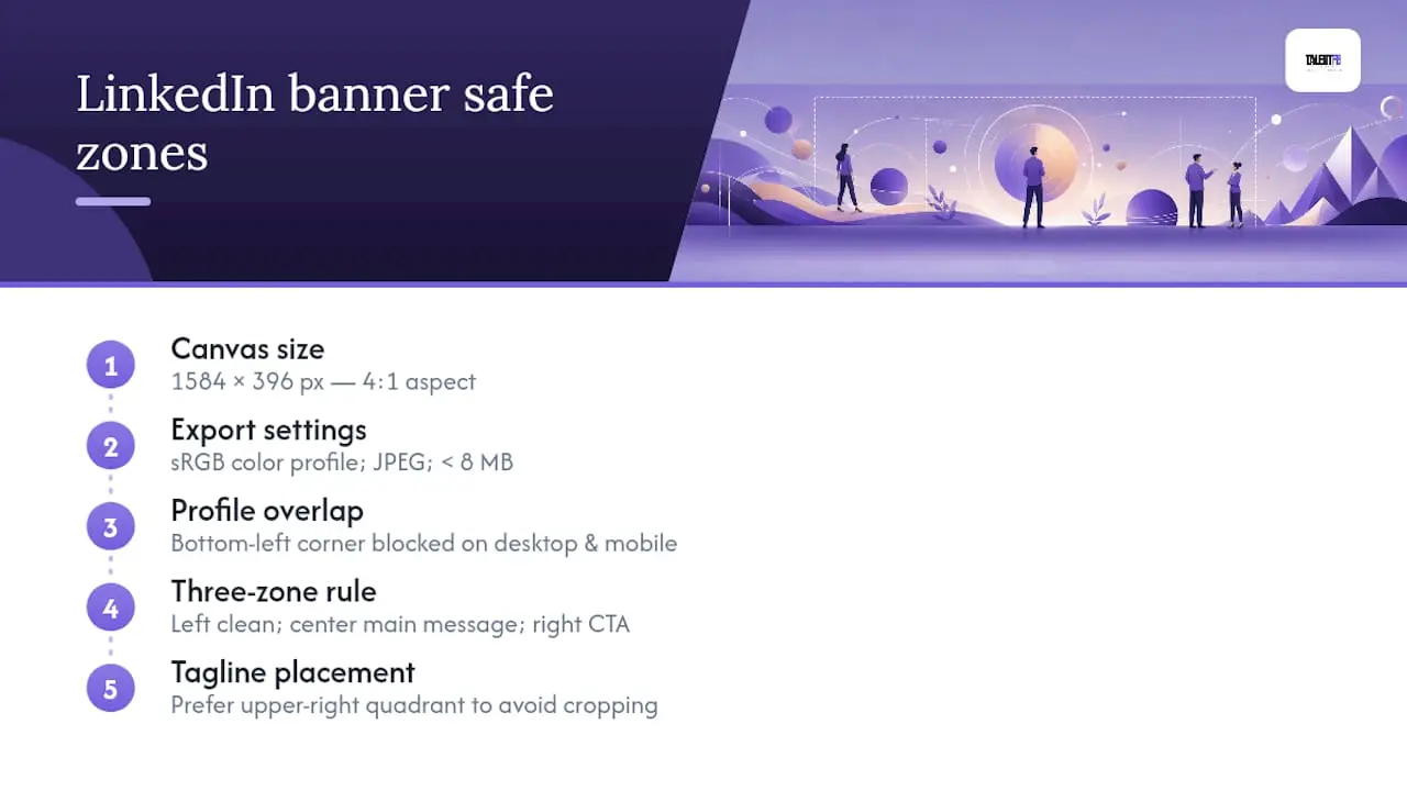
Before you publish, run through this checklist: correct pixel dimensions, sRGB color profile, JPEG file type, file size under 8 MB, and a mobile preview to confirm nothing important got clipped.
5. Fast Dos and Don’ts for a Professional Banner
Do:
- Keep one message per banner. Two competing ideas cancel each other out.
- Test the mobile crop before publishing, not after.
- Match your banner’s promise to your headline word for word in spirit.
- Sample two or three colors from your headshot so the banner and photo feel like one design.
Don’t:
- Place critical text under where your profile photo sits.
- Stack more than one or two logos. A wall of badges reads as clutter, not credibility.
- Use small type or low-contrast text that disappears on a phone screen.
- Default to generic stock photography with no connection to your actual role.
If your banner currently breaks one of these rules, the fix is usually a five-minute edit, not a redesign.
6. What Hiring Teams Actually Notice: A TalentFB Insider Checklist
After spending years inside hiring rooms, I can tell you recruiters scan banners faster than most job seekers assume. They’re looking for a handful of specific signals:
- Role clarity — can they tell what you do and what you want within two seconds?
- Geography or openness — does the banner state a location or relocation flexibility, or leave it ambiguous?
- Measurable results — one number beats five adjectives every time.
- A clear next step — a soft CTA like “Let’s talk hiring strategy” gives a recruiter permission to reach out.
- Social proof — a press badge or client logo, used once, tells them someone else already vetted you. Reachly’s research found this mix of promise, proof, and CTA shows up repeatedly in banners that convert views into messages.
Pro Tip: Read your banner, headline, and About section back to back. If they tell three different stories, a recruiter will trust none of them. Align all three around one positioning statement, and if you want a deeper walkthrough, our guide on positioning C-suite profiles breaks down exactly how that alignment should read.
7. What to Write on the Banner: Tagline, CTA, and Placement
Text is where most banners fall apart. People either write too much or bury the one line that matters.
Stick to three elements, maximum: a tagline, an optional CTA, and contact info if there’s room. Your tagline should state what you do and for whom, in under eight words. “Helping fintech startups scale engineering teams” works. “Passionate about innovation and growth” does not, because it says nothing measurable.
If you include a CTA, keep it soft and specific. “Book a 15 minute call” or “See recent case studies” gives a visitor a next step without feeling like a sales pitch plastered across your profile. Skip a CTA entirely if you’re mid job search. A results-driven tagline does more work than a call to action when the goal is getting noticed, not booked.
Contact information rarely belongs on the banner itself since your profile already surfaces that. The exception is founders or consultants running a specific campaign, where a short URL in the corner can drive traffic to a landing page.
Placement matters as much as wording. Every line of text belongs in the center-right band of the canvas, roughly where your eye lands after glancing at the profile photo. Anything placed further left risks disappearing under the photo overlay on mobile.
8. Customizing Templates Without Losing Your Personal Brand
Templates are a starting point, not a finished product. The fastest way to look like everyone else on LinkedIn is publishing a banner straight out of Canva with the placeholder text swapped and nothing else changed.
Start with color. Pull two or three shades directly from your headshot or company palette instead of keeping the template’s defaults. This single step does more to make a banner feel custom than any layout change.
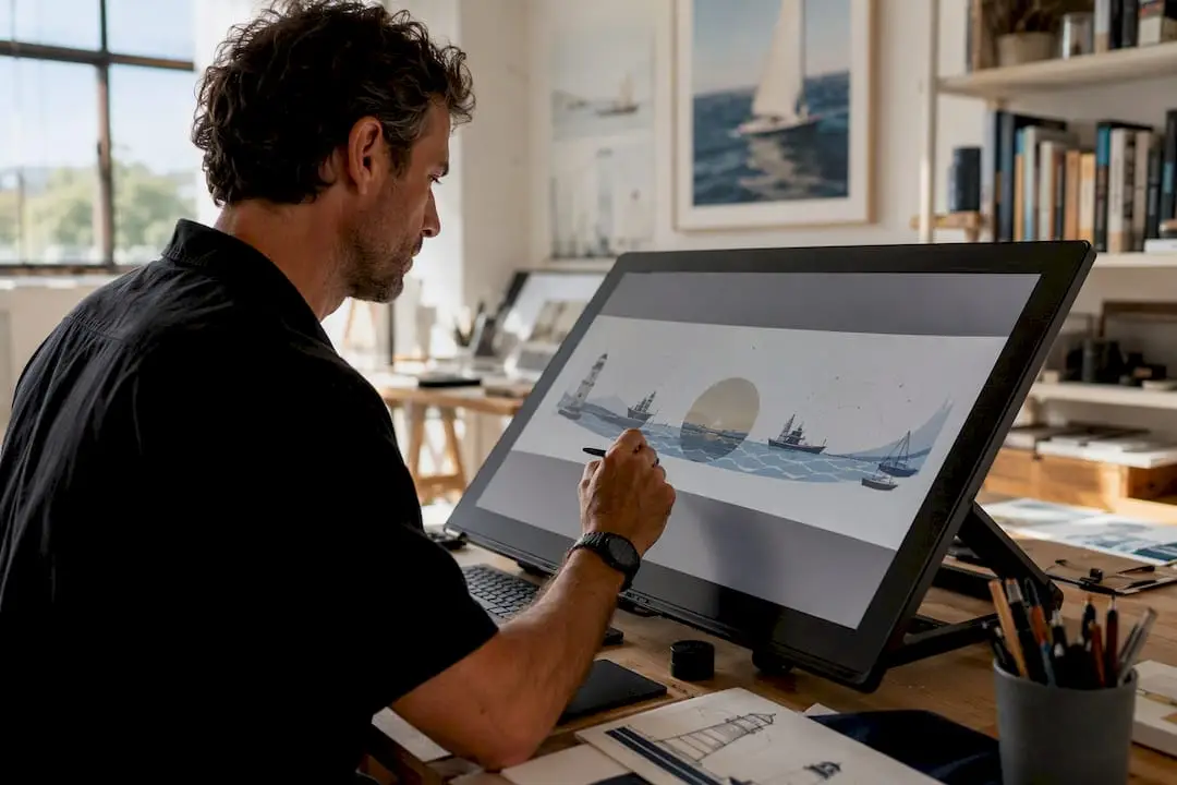
Next, replace stock icons or generic imagery with something specific to your work. If the template includes a generic laptop photo and you’re in maritime tech, swap it for a vessel, a port, or an actual project shot. Specificity reads as authenticity.
Keep your font choice consistent with whatever you use elsewhere in your personal brand, whether that’s a resume, portfolio site, or pitch deck. Two or three fonts across all your materials is plenty. More than that starts to look unplanned.
Finally, resist the urge to fill every inch of the template. Most templates are designed with more decorative elements than a professional banner needs. Strip out anything that doesn’t support your one core message, even if it means deleting half of what came with the template.
9. Banner Ideas by Industry and Role
A banner that works for a sales executive will look wrong on a software architect, and that’s fine. Context should drive the design.
They read as noise, not substance.
Finance and advisory: understated color palettes, a results chart, or a credentials strip works well here. Financial advisors in particular benefit from banners that project stability over creativity. Mastermind Advisor’s guide on financial advisor LinkedIn profiles covers this profession-specific approach in more depth.
Creative and design: a portfolio preview grid or a bold abstract pattern signals visual range immediately.
Founders and executives: mission statements, press logos, or a photo from a keynote or panel appearance. This is where the logo wall idea earns its keep.
Recruiters and HR leaders: a team photo or culture shot builds warmth faster than any tagline could.
Consultants: service pillars or a client logo wall, since trust signals matter more than visual flair in this category.
Match the banner to the room you’re trying to walk into, not the room you’re currently standing in.
Pick Clarity Over Cleverness
If you’re job hunting, I’d rather see a plain banner with one honest results statement than a beautifully designed one that says nothing measurable. If you’re a founder, lean into mission and press, since that builds trust faster than polish ever will. Pick one template today and show it to a colleague or recruiter before you publish. Their two-second reaction will tell you more than another hour of tweaking colors.
Get Your LinkedIn Banner and Profile Built Right
A great banner only gets you halfway there. If your headline, About section, and outreach strategy don’t back up that first impression, you’re leaving interviews and opportunities on the table. TalentFB has coached over 350 senior professionals toward new roles with a 90-day median placement timeline, and for founders and CEOs, Talent/OS rebuilds your entire LinkedIn presence to attract talent without paying executive search fees.
If you’re a senior tech professional aiming for your next role, our executive branding guide walks through how banner, headline, and content work together as one system. Ready to see what that looks like for your profile? Book a profile optimization session and get your banner, headline, and About section aligned in one sitting.
Frequently Asked Questions
What size should a LinkedIn banner be?
The correct dimensions are 1,584 x 396 pixels, a 4:1 aspect ratio, exported as sRGB JPEG and kept under 8 MB.
Where can I find free LinkedIn banner templates?
Canva and Adobe Express both offer free, editable templates. Figma Community is a strong option if you want more design control and are comfortable with vector tools.
How often should I update my LinkedIn banner?
Job seekers benefit from refreshing every 3 to 6 months as their positioning evolves. Executives with a settled personal brand can go 18 to 24 months between updates.
What should I avoid putting on a LinkedIn banner?
Avoid placing text or logos in the bottom-left corner, since your profile photo covers that area on both desktop and mobile. Also skip low-contrast colors, overcrowded logo walls, and generic stock photography with no connection to your role.
Do executives need a different banner approach than job seekers?
Yes. Job seekers benefit most from a results-driven tagline that states what they’re targeting. Executives and founders typically get more value from mission statements, press mentions, or a logo wall that signals credibility and scale.
Sources
- 17 LinkedIn banner ideas and examples
- 10 LinkedIn Background Photo Ideas and Inspiration
- LinkedIn Banner Maker – Free 1584×396 Cover Tool
- LinkedIn Background Photo: Size, Safe Zone & Ideas